When managing branding across web, mobile, and desktop, consistency is critical. Small mismatches in colors, fonts, or layouts can erode trust and frustrate users. Low-code platforms simplify this process by centralizing design systems, ensuring uniform branding across devices without requiring extensive manual updates.
Here’s a quick breakdown of five platforms that address these challenges:
- Mendix: Offers the Atlas UI Framework for consistent branding across web and mobile, with tools like Theme Creator and reusable UI modules.
- OutSystems: Features a Theme Editor for centralized styling, runtime theme switching, and Live Style Guides for real-time updates.
- Appian: Uses its SAIL design system to provide responsive, accessible branding with tools like Branding Preview and a Design Library.
- FlutterFlow: Integrates with Figma for seamless design imports and generates native code for iOS, Android, and web apps from a single codebase.
- Pega: Relies on design tokens and mixins for efficient branding updates, with tools to manage global themes and portal-specific customization.
Each platform has unique strengths, catering to different project needs, including free low code platforms for those starting with limited budgets. For instance, Mendix and OutSystems excel in enterprise-grade consistency, while FlutterFlow is ideal for design-focused teams. Appian and Pega are tailored for industries requiring strict process automation.
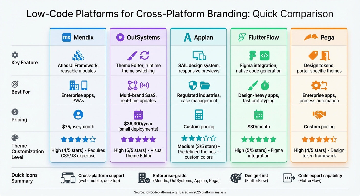
Quick Comparison
| Platform | Key Feature | Best For | Pricing (Starting) |
|---|---|---|---|
| Mendix | Atlas UI Framework, reusable modules | Enterprise apps, PWAs | $75/user/month |
| OutSystems | Theme Editor, runtime theme switching | Multi-brand SaaS, real-time updates | $36,300/year (small) |
| Appian | SAIL design system, responsive previews | Regulated industries, case management | Custom pricing |
| FlutterFlow | Figma integration, native code generation | Design-heavy apps, fast prototyping | $30/month |
| Pega | Design tokens, portal-specific themes | Enterprise apps, process automation | Custom pricing |
Low-code platforms streamline branding by reducing manual effort and ensuring consistency across devices. Your choice depends on your branding goals, technical needs, and whether you require proprietary low code platforms for advanced enterprise features.
Low-Code Platform Comparison: Features, Pricing, and Best Use Cases
1. Mendix
Mendix simplifies cross-platform branding with its Atlas UI Framework, a low code development platform and unified design system designed for web, native mobile, and progressive web apps. This framework operates with different technologies - SASS for web applications and JavaScript for native mobile apps - all managed within the App Explorer. By combining these technologies, Mendix ensures consistent branding while eliminating the need to learn separate styling systems.
Theme Customization
Mendix centralizes brand control using two key files: custom-variables.scss for web applications and custom-variables.js for native mobile apps. These files allow developers to globally adjust elements like colors, typography, and spacing across the entire application. Additionally, Mendix supports creating reusable UI modules that package your design system. These modules can be exported and applied to new projects, ensuring every app maintains a consistent brand identity from the start.
The platform’s Theme Creator tool automates much of the process. By uploading your logo, it extracts brand colors and applies them throughout the app. For fonts, Mendix integrates with the top 40 Google fonts, and if security policies require, you can also host custom font files locally.
Cross-Platform Consistency
Mendix takes theme customization a step further by ensuring uniformity across all interactions. Using Design Properties, developers can maintain brand standards without writing custom code. Instead of adding custom CSS for each element, developers simply select pre-defined brand variations - like primary or secondary buttons - directly in the IDE. This approach is estimated to handle 90% of layout scenarios, significantly reducing the need for manual overrides.
For example, The Raben Group successfully developed a unified "Track and Trace" application used by over 100,000 users across 15 countries. Despite integrating with 15 different back-office systems, the app delivers a consistent customer experience, showcasing Mendix's ability to maintain cohesive design.
To avoid branding conflicts during updates, Mendix advises against modifying files in the "core" styling folders. Instead, customizations should be made in the theme or themesource folders. When working with multiple styling modules, you can control the compilation order in App Settings to ensure your custom themes correctly override the default platform styles.
sbb-itb-33eb356
2. OutSystems
OutSystems takes a dynamic approach to cross-platform branding with its Theme Editor, a visual tool built directly into Service Studio. This tool simplifies styling tasks, reducing what could take a week of manual CSS work to just minutes.
Theme Customization
OutSystems' Corporate Theme system allows centralized control over branding across multiple applications. Developers can create a base theme that defines core brand elements - like logos and heading styles - ensuring that any updates to the brand are automatically applied to all connected apps. For teams managing multiple brands or client-specific interfaces, the platform offers runtime theme switching via CSS variables. This feature is particularly useful for SaaS applications needing to cater to different tenants or support user preferences like dark and light modes.
These customizations integrate effortlessly with OutSystems' extensive component library, streamlining the branding process.
Cross-Platform Consistency
OutSystems UI includes over 100 pre-built components designed with atomic design principles [26, 28]. The system features a standardized design framework that incorporates:
- Four distinct color palettes: Brand, Extended, Neutral, and Semantic
- A modular typography scale
- An 8-point grid system for uniform spacing across platforms
The 8-point grid ensures that margins, paddings, and element dimensions align perfectly, maintaining visual consistency between web and mobile applications.
Additionally, the platform features Live Style Guides, centralized repositories where teams can define and reuse brand colors, patterns, and screen templates. For example, VÍS, an Icelandic insurance company, utilized this feature to enhance its user experience. Guðný Herbertsdóttir, Managing Director of Digital at VÍS, shared:
"We perfected all aspects of the user experience because the speed of development provided by OutSystems made it much easier to rapidly iterate and fine-tune".
Integration with Brand Assets
OutSystems bridges the gap between design and development through its integrated asset tools. Design Kits for Figma and Sketch replicate the platform's UI framework, ensuring alignment between design prototypes and final applications [7, 28]. The platform's two-layer architecture - comprising a Base Style Guide (foundation) and a Custom Style Guide (tailored branding) - fosters consistency while allowing teams to adapt branding for individual applications.
For teams managing brand assets, OutSystems recommends the "Specialize" method: instead of starting from scratch, modify the built-in style guide with your primary colors and typography. This approach balances customization with the efficiency of leveraging the existing UI framework.
3. Appian
Appian's approach to cross-platform branding revolves around its SAIL design system, which follows a "build-once" philosophy. This ensures responsive and accessible experiences across web, iOS, and Android platforms. Building on earlier examples from Mendix and OutSystems, this section highlights how Appian achieves a unified branding experience.
Theme Customization
Appian simplifies global branding with its Site and Portal Branding configurations. Developers can define key elements - like header bar hex codes, accent colors, and loading bars - all from a single location. For a polished look, Appian includes predefined dark themes such as "Charcoal", "Navy", and "Plum".
The platform also allows precise customization of visual elements. Developers can choose between squared, semi-rounded, or pill-shaped borders for UI components and standardize button capitalization. To maintain accessibility, Appian enforces a minimum contrast ratio of 4.5:1 for accent colors against white backgrounds.
Integration with Brand Assets
Appian supports the upload of custom logos in formats like .svg, .jpg, .jpeg, or .png, ensuring optimal contrast with transparent backgrounds.
One standout feature is the Branding Preview tool. This tool, available within the interface designer, lets developers visualize how global branding settings will look on a specific site or portal during the design phase. This ensures brand consistency from the start. For mobile applications, Appian provides a self-service Mobile Branding application via Appian Community, enabling organizations to create branded versions of the Appian mobile app. This includes custom colors, icons, and introductory experiences.
Cross-Platform Consistency
Appian's interface designer supports previews across multiple device widths, from Phone to Wide Desktop, to ensure branding adapts seamlessly to different screen sizes. Navigation elements, such as the Header Bar (available in styles like Helium, Mercury, and Oxygen) or Sidebar layouts, automatically adjust into collapsible menus on smaller screens.
For organizations managing numerous applications, Appian's Design Library is a valuable resource. This library allows teams to create and maintain standardized layouts and components, ensuring consistent design across all projects.
4. FlutterFlow
FlutterFlow takes a design-first approach, leveraging Google's Flutter framework to deliver cross-platform branding solutions. With a user base exceeding 3 million, it has become a go-to tool for teams looking to maintain consistent branding across iOS, Android, and web apps. Its visual development platform offers over 200 customizable UI elements, making it accessible to both developers and designers.
Theme Customization
FlutterFlow simplifies design system management, especially with its smooth integration with Figma. Teams can import their existing design systems directly from Figma using a file URL, which automatically imports key elements like colors and typography [46–48]. These design systems can then be stored as libraries and shared across projects, ensuring branding remains cohesive.
The platform supports custom font files in .ttf and .otf formats, allowing teams to use proprietary typefaces. For more tailored branding needs, developers can create custom Dart functions and widgets, giving them full creative control. Will Croushorn, Product Owner at FreshAI for Wendy's, shared his experience:
"We selected FlutterFlow because it streamlines our development process, enabling us to turn ideas into reality faster than ever. This tool gives our team the flexibility to be agile and responsive, ensuring we stay ahead in delivering exceptional experiences to our customers".
This level of control also extends to tools designed to ensure layouts are responsive.
Responsive Design
FlutterFlow goes beyond just managing themes by offering tools for building adaptive user interfaces. These built-in features allow designers to create layouts that adjust automatically to various screen sizes. With a real-time preview function, designers can instantly see how elements like logos and buttons will look on mobile, tablet, and desktop devices. This eliminates the trial-and-error process, ensuring that branded components scale correctly across all platforms.
Cross-Platform Consistency
FlutterFlow generates clean Flutter code that compiles natively for iOS, Android, and web apps - all from a single codebase. Automated testing ensures that UI elements remain stable and consistent across platforms. For those who need precise control, the platform allows developers to fine-tune widgets to align perfectly with branding requirements. Mohamed, Growth Product Manager at BluePass, highlighted the productivity boost:
"FlutterFlow multiplies our team's velocity by 10X".
Additionally, the option to export code ensures that organizations maintain full ownership of their intellectual property, providing flexibility and security for future use.
5. Pega
Pega's Constellation design system simplifies branding for enterprise apps across web and mobile platforms. Like other tools such as Mendix, OutSystems, Appian, and FlutterFlow, Pega tackles the challenges of cross-platform branding with a unified system. Its design token framework ensures that any updates to branding elements automatically propagate throughout the application ecosystem.
Theme Customization
Pega uses design tokens to manage branding elements like colors, typography, and spacing. These tokens automatically adjust hover, active, and focus states, streamlining the process for developers. Theme settings are accessible via App Studio (Settings > Theme), where developers can customize logos, application names, and color palettes.
The platform's mixin system takes a sophisticated approach to styling, allowing developers to update multiple components at once. As Pega Academy explains:
"Mixins are a higher-level abstract that can affect multiple components at once. As such it is important to use mixins as much as possible to define the tokens of your design system".
This means a single tweak to a mixin can refresh borders, backgrounds, and text styles across numerous UI elements, saving time and ensuring consistency.
Pega also offers a Center of Excellence (COE) layer where teams can store reusable design elements - like web fonts, icons, and templates - and share them across applications. Additionally, the theme landing page highlights color combinations that fail to meet Web Content Accessibility Guidelines (WCAG), helping brands maintain accessibility while staying true to their visual identity.
This centralized system ensures that branding remains consistent across all devices and platforms.
Cross-Platform Consistency
Pega's Constellation design system ensures branding consistency across desktop and mobile platforms by generating platform-specific styles from a centralized theme. It also allows each portal to have its own unique "brand" while sharing a global theme. As Pega Academy puts it:
"Each portal can have a different 'brand,' but can all use the same global 'theme'".
This flexibility enables businesses to create tailored experiences for different user groups while maintaining a cohesive overall brand identity.
For mobile applications, Pega offers customization tools to ensure branding transitions seamlessly from web to mobile. The Reuse Library supports this by letting developers create and share brand-compliant components across various parts of an application. To unlock full theming capabilities, applications must inherit from the pyEndUser_ExpressDefault skin, which enables style variations and comprehensive branding options.
Integration with Brand Assets
Pega makes it easy to integrate brand assets by supporting direct logo uploads and providing an icon font library. Developers can configure application headers to display logos, application names, or both, allowing each portal to maintain a distinct look while adhering to brand guidelines. For more specialized branding needs, the "Edit CSS" feature lets developers add custom CSS directly to the application skin for precise control.
The combination of the mixin system and the COE layer sets Pega apart, enabling teams to update entire groups of components from a single source. This approach not only simplifies branding updates but also ensures a polished, cohesive user experience, reinforcing a strong and consistent brand presence across all applications.
Pros and Cons
Low-code platforms bring a mix of strengths and challenges when it comes to maintaining a consistent brand identity across devices. Here's a closer look at how some of the key players handle cross-platform branding.
Mendix stands out with its Private Marketplace, which simplifies the sharing of branded UI resources. However, customizing the Atlas UI framework requires advanced skills in CSS and JavaScript, which can be a hurdle for some teams.
Other platforms, like Retool and Power Apps, offer alternative approaches. Retool, for instance, integrates seamlessly with Figma through its Theme Generator plugin, allowing design variables to flow directly into the platform. This minimizes manual errors but limits organization-wide themes to Business or Enterprise plans. On the other hand, Power Apps struggles with significant limitations in its branding tools. Custom themes often default to system CRM themes on mobile apps, and its lack of solution-aware theme management means users must manually export and import theme tables between environments.
Here's a quick comparison of branding features across the platforms:
| Platform | Theme Customization | Responsive Design | Cross-Platform Consistency | Integration with Brand Assets |
|---|---|---|---|---|
| Mendix | High – Customizable Atlas UI framework via CSS/JS | Multi-profile support for mobile, tablet, and responsive flows | High – Reuses logic across device profiles | Excellent – Private Marketplace for branded UI |
| Retool | Token-based customization with custom fonts/design tokens | Light/dark mode toggles; app and org-level themes | High – Consistent themes across internal apps | Strong – Figma integration for direct design variable migration |
| Power Apps | Limited – Themes may default to system themes on mobile | Limited – Themes often fail to apply uniformly | Inconsistent – No solution-aware themes | Manual – Requires export/import of theme tables |
In summary, Mendix offers powerful features but demands technical expertise for advanced customization. Retool is a strong choice for teams already using Figma, thanks to its seamless integration. Meanwhile, Power Apps lags behind, requiring more manual effort to achieve consistent branding across platforms.
These differences underscore how the choice of a low-code platform can directly affect branding consistency and overall development efficiency and customer experience.
Conclusion
Choosing the right low-code platform hinges on your branding needs and project goals. Mendix and OutSystems lead the enterprise market, with Mendix recognized as a leader in the 2025 Gartner Magic Quadrant for Enterprise Low-Code Application Platforms. Mendix shines when you need consistent branding across web, native mobile, and PWA from a single source model. On the other hand, OutSystems' Live Style Guide architecture ensures real-time synchronization of design elements across development, staging, and production environments.
For teams focused on design, FlutterFlow is an excellent choice for creating pixel-perfect prototypes quickly. However, it lacks the backend scalability needed for complex enterprise logic compared to Mendix or OutSystems. Meanwhile, Appian and Pega are tailored for process automation and case management in regulated industries. While they excel in those areas, they are less adaptable for building custom-branded consumer applications.
Pricing also varies significantly. Mendix starts at $75 per user per month, OutSystems costs approximately $36,300 per year for smaller deployments, and FlutterFlow is available at $30 per month.
"Consistency is the cornerstone of successful branding. Whether you're building a web application or a mobile platform, maintaining a unified design language ensures a seamless user experience." - Hariharan C, OutSystems UI Style Guide
For those concerned about vendor lock-in, platforms like FlutterFlow, which allow full source code export, provide greater long-term flexibility and ownership. To explore and compare platforms based on features like AI integration or automation capabilities, visit the Low Code Platforms Directory at https://lowcodeplatforms.org.
FAQs
Which platform is best for multi-brand theming?
When it comes to multi-brand theming, Supernova and Builder.io are top contenders. Supernova allows organizations to create multi-branded design systems, balancing the need for brand individuality with consistent design standards. On the other hand, Builder.io provides AI-driven tools and a robust enterprise CMS, streamlining brand management processes.
Other noteworthy options include Webflow, known for its ability to develop scalable design systems, and OutSystems, which excels at handling multiple themes within applications. Ultimately, the best platform will depend on your specific requirements, but Supernova and Builder.io lead the pack in this space.
How do design tokens keep branding consistent?
Design tokens are a powerful way to maintain branding consistency. They store essential visual design attributes - like colors, typography, and spacing - as reusable, platform-independent elements. By centralizing these attributes, any update to a token instantly reflects across all platforms, saving time and reducing errors.
Tokens also bridge the gap between designers and developers. They act as a shared reference point for visual styles, ensuring everyone is on the same page. This approach not only speeds up updates but also supports scalable design systems, all while keeping the brand identity consistent and cohesive.
Can I export and own the app’s source code?
Many low-code platforms offer the option to export and take full ownership of your app’s source code. For instance, some platforms allow you to export code like HTML, CSS, and React.js, giving you the flexibility to customize it, host it on any server, and claim full ownership. Always review the platform’s specific export features to ensure they align with your requirements.

