When it comes to designing low-code applications, layout plays a critical role in how users interact with your app. A poor layout can confuse users, while a clear and intuitive one improves navigation, reduces frustration, and keeps users engaged. Here’s what you need to know:
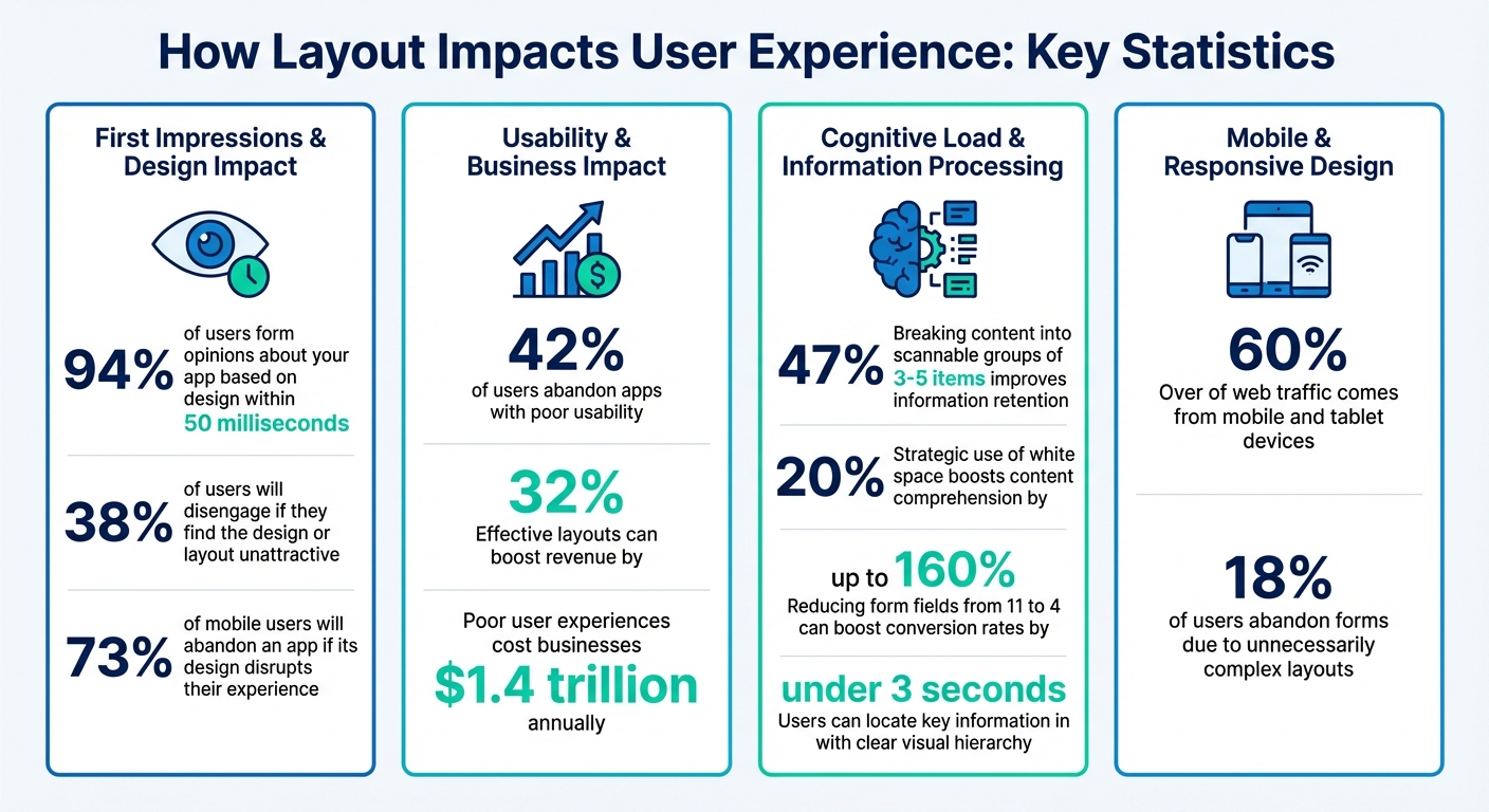
- First Impressions Matter: 94% of users form opinions about your app based on design within 50 milliseconds.
- Usability Drives Retention: 42% of users abandon apps with poor usability, while effective layouts can boost revenue by 32%.
- Simplify Navigation: Reducing clutter, grouping items logically, and using white space strategically improves clarity and reduces cognitive load.
- Consistency is Key: Uniform buttons, spacing, and predictable navigation build trust and make apps easier to use.
- Responsive Design: Ensure layouts work seamlessly across devices, from mobile to desktop, using tools like auto-layout containers and breakpoints.
Key UX Statistics for Low-Code App Layout Design
How To Build Mobile Friendly Apps With Intent-Based Auto-Layouts
sbb-itb-33eb356
Why Layout Matters for User Experience
In free low code platforms, where speed is a priority, an efficient layout is essential. A well-thought-out layout guides users seamlessly, helping them intuitively understand what to do next. A poorly designed layout, on the other hand, creates unnecessary hurdles, making users work harder and often leading to frustration.
Consider this: 94% of a user’s first impression is influenced by design, and this happens in just 50 milliseconds. Even more striking, 38% of users will disengage if they find the design or layout unattractive. For mobile users, the stakes are even higher - 73% will abandon an app if its design disrupts their experience.
"Design quietly shapes that experience, deciding what gets noticed, what gets skipped, and how the story unfolds."
- Lacey Meehan, Senior Art Director, Liquid
The success of a layout depends on how well it aligns with users' natural thought processes. A good layout reduces the mental effort needed to navigate the app. A bad one? It creates confusion and drives users away.
Reducing Cognitive Load
Every element on a screen demands attention. When users open an app, they’re processing relationships, making choices, and predicting outcomes. Poor layouts add unnecessary mental strain, making users focus on deciphering the interface rather than completing tasks.
This extra effort, known as "extraneous cognitive load", is a major obstacle to a positive user experience. Cluttered screens, inconsistent design patterns, and unclear hierarchies all contribute to this problem. When faced with too much information or confusing layouts, users often feel overwhelmed and abandon the app.
The key is simplification. Breaking content into scannable groups of 3–5 items can improve information retention by 47%. Similarly, using white space strategically can boost content comprehension by 20%. These aren’t just aesthetic tweaks - they’re practical ways to make information easier to process.
"Minimalism is a cognitive strategy, not an aesthetic choice - every element on screen demands mental processing; reducing elements reduces the mental energy users spend navigating."
- Boundev Team
Even small changes can make a big difference. For instance, reducing form fields from 11 to 4 can boost conversion rates by up to 160%. This works because fewer fields mean fewer decisions and less visual clutter. Similarly, applying Hick’s Law - limiting navigation options to 5–7 items - helps prevent decision paralysis and speeds up task completion.
A clear visual hierarchy is equally important. By using size, color, and positioning effectively, users can locate key information in under 3 seconds. For example, placing primary buttons like "Submit" with 24–32px of margin around them draws attention and encourages interaction.
These strategies simplify the user’s mental journey, making navigation more intuitive.
Improving Navigation and Accessibility
Good navigation provides clear paths, allowing users to find what they need quickly. Users tend to scan screens in predictable ways - F-patterns for text-heavy content and Z-patterns for more visual layouts. Ignoring these scanning habits can lead to frustration and app abandonment.
Spacing plays a critical role in creating clarity. For example:
- Place labels 4–8px from their fields to establish clear associations.
- Maintain 16–24px between field groups to avoid unintentional grouping.
- Use 32–48px between sections to signal shifts in content and give users "breathing room".
| Element Relationship | Recommended Spacing | Purpose |
|---|---|---|
| Label to Field | 4–8px | Ensures clear associations; reduces confusion |
| Field to Next Label | 16–24px | Prevents grouping unrelated fields |
| Section to Section | 32–48px | Helps users process shifts in content |
| Primary CTA Margin | 24–32px | Draws attention to key actions |
Accessibility ensures your app works for everyone, including users with visual or motor impairments. Follow WCAG guidelines by maintaining a 4.5:1 color contrast ratio for normal text and 3:1 for large text. For mobile apps, ensure touch targets are at least 44px to avoid accidental clicks.
Another useful approach is progressive disclosure, which reveals information only when it’s needed. This keeps users focused and prevents cognitive overload.
"The best interfaces reveal complexity only when the user is ready for it."
- Alan Cooper
Consistency is the final piece of the puzzle. Uniform buttons, icons, and spacing across screens help users build mental models, making navigation second nature. When users don’t have to relearn the interface with every interaction, they can focus on their goals. This consistency enhances the layout’s effectiveness, ensuring an efficient and enjoyable experience throughout your low code app.
Core Principles for Effective Layout Design
When it comes to creating layouts for low-code apps, you don’t need to be a professional designer. A few tried-and-true principles can help you build interfaces that feel intuitive and work efficiently.
Visual Hierarchy
Use size, color, and contrast to guide users' attention to the most important elements on the screen. Keep it simple by focusing on one to three key focal points per screen. For instance, a larger, brightly colored call-to-action button naturally draws the eye, making it clear where users should click. This approach also supports consistency across your design.
Consistency
Uniformity in buttons, icons, and spacing creates a sense of trust and makes the app easier to use. Stick to a cohesive color palette - ideally no more than five colors - to maintain a polished, harmonious look.
Balance and White Space
Strategic use of white space (or negative space) helps avoid visual clutter. By evenly distributing visual elements and giving them breathing room, you make the layout easier to read and interact with. Thoughtful spacing also helps group related items, improving clarity.
"Simplicity is king as it allows people's eyes to easily find their way around an app and makes for a pleasant visual experience."
- Sarah Valencia Vivas, Appli
Proximity and Grouping
Place related elements close together or use tools like cards and borders to show their connection. This makes it easier for users to understand which items belong together and what their purpose is.
Establishing a Clear Information Hierarchy
Refining user guidance starts with a well-defined information hierarchy. This concept determines the order in which users notice and interact with the elements in your app. It ensures attention flows naturally to the most important features without overwhelming users. Since first impressions are made in milliseconds, getting this right is crucial.
Size is one of your strongest tools. Larger elements naturally grab attention and convey importance. For instance, a primary call-to-action button should be bigger than secondary options - ideally, at least 48 pixels in height to ensure both prominence and ease of use on mobile devices. A helpful rule is the 60-30-10 approach: allocate 60% of content at a standard size, 30% at a slightly larger scale for important elements, and 10% at the largest scale for critical focal points. To maintain consistency, use a type scale multiplier like Major Third (1.25x) or Perfect Fifth (1.5x) to distinguish headings from body text.
Color and contrast are immediate attention-grabbers. Bright, high-contrast colors should be reserved for primary actions, while muted tones work best for secondary elements. This approach reduces visual noise and makes navigation intuitive. To ensure accessibility, text should meet a contrast ratio of at least 4.5:1 against its background, while larger text requires a minimum ratio of 3:1.
"Visual hierarchy is simply the ordering of visual elements so people see what matters first - and it's the difference between an interface that converts and one that confuses." - Robin Dhanwani, Founder of Parallel
Beyond size and color, placement plays a vital role in directing attention.
Strategic placement aligns with natural scanning patterns. Users often scan screens in predictable ways: the F-Pattern for text-heavy screens (starting from the top and left) and the Z-Pattern for simpler layouts like landing pages, where the eye moves from top-left to right, then diagonally to the bottom-right. Position key content along these paths to maximize visibility. Low-code platforms often come with grids and alignment tools, helping you maintain consistent layouts so elements like logos and menus stay where users expect them.
A quick way to evaluate your hierarchy is the squint test: step back, squint at the screen, and observe which elements stand out. If the most noticeable features aren’t your priorities, adjust their size or color. A strong hierarchy can lead to a 30% boost in conversion rates and a 20% improvement in text comprehension.
Maintaining Consistency Across Screens
Consistency is a cornerstone of low-code UX design, especially when it comes to apps. Users should never feel like they need to relearn navigation as they move from one screen to another. Consistency means keeping buttons, menus, and navigation tools in predictable locations with the same functionality throughout your app. It’s not just about aesthetics - this approach reduces cognitive load and fosters trust. In fact, up to 90% of a user’s first impression hinges on design consistency, while poor navigation can lead to abandonment rates as high as 70%.
Imagine something as simple as a "back" button shifting positions between screens. This forces users to pause, reorient themselves, and second-guess their actions. A well-structured, consistent design allows users to focus on their tasks, not on figuring out how to navigate. As Gulshan Rahman, a design expert, puts it:
"Consistency goes beyond making things look the same: it's about making the experience feel the same".
Low-code platforms simplify this process with design tokens - centralized variables for colors, fonts, and spacing. For example, if you update the color of a primary button in your design system, that change will automatically apply across all screens. This can cut manual design adjustment time by 30% to 50%. Paired with reusable components, design tokens ensure every screen aligns with your established design system.
Consistency operates on two levels: internal and external. Internally, it means maintaining uniformity within your app - using the same terminology (e.g., sticking to either "Log in" or "Sign in"), keeping spacing consistent across elements, and ensuring gestures like swiping behave identically everywhere. Externally, it involves aligning with familiar industry standards, such as placing search bars in the top-right corner, so users can draw on their experience with other apps. Together, these forms of consistency create a polished and reliable user experience.
To keep things consistent as your app evolves, establish a design system early. Use standardized components, grids for alignment, and a limited color palette of no more than five tones. These practices help prevent "design drift", where small inconsistencies creep in over time and undermine user confidence. A consistent design not only builds trust but also lays the groundwork for responsive layouts that work seamlessly across all devices.
Optimizing for Responsive Design
With over 60% of web traffic coming from mobile and tablet devices, ensuring your low-code app works smoothly across all screen sizes - from compact smartphones to expansive desktop monitors - is non-negotiable. Responsive design is what separates an app users rely on from one they abandon out of frustration. This shift toward mobile-first experiences underscores the importance of tools that can adjust layouts effortlessly.
Low-code platforms simplify this process with auto-layout containers like Horizontal, Vertical, Row, Column, and Wrap. These containers automatically adjust how elements are displayed based on the available space. For instance, a row of cards that appears side-by-side on a desktop can stack vertically on a mobile device by enabling the Flex Wrap property. This ensures your app’s layout adjusts seamlessly to any screen size.
Prioritize relative sizing over fixed pixels. Instead of assigning a fixed width (e.g., 300 pixels) to a sidebar, you can use formulas like Parent.Width * 0.25 to allocate a quarter of the available space. Many platforms also offer features like flex factors or fill portions, which distribute remaining space proportionally - perfect for creating layouts like a 1/4 sidebar alongside a 3/4 main content area. To prevent awkward stretching on larger screens, disable settings like "Scale to fit" and "Lock aspect ratio".
Set breakpoints at standard widths - such as 600px, 900px, and 1,200px - to fine-tune your layout for different screen sizes. Most low-code tools classify devices into categories like Small (Phone), Medium (Tablet), and Large/Extra Large (Desktop), allowing you to create tailored layouts for each. For example, you could hide a sidebar on mobile devices and replace it with a hamburger menu or shift from a multi-column grid to a single-column list.
To ensure everything looks and functions as intended, take advantage of the low-code QA automation tools many platforms provide. These tools let you preview how your layout responds to different screen sizes before deployment. However, always test on actual devices for the best results. While browser emulators are helpful for initial checks, they can miss performance issues and touch gesture problems that only real devices can reveal.
Using Low Code Platform Features to Improve Layouts
Low-code platforms simplify interface assembly by transforming layout design into a visual, intuitive process. These tools not only speed up development but also ensure accessible, consistent layouts, enabling you to rapidly build professional interfaces without compromising quality.
Using Drag-and-Drop Interfaces
Visual builders streamline layout creation by replacing manual coding with a drag-and-drop approach. With these tools, you can select UI elements - like buttons, forms, or charts - from a repository and place them directly on a canvas. This "What You See Is What You Get" (WYSIWYG) method provides instant feedback, letting you preview and refine your layout in real time before deployment.
Many platforms also include features that automatically adjust widgets when new elements are added, saving you the trouble of reorganizing layouts manually. For instance, Appsmith's "Reflow" feature uses approximately 8,000 lines of code to handle complex collision scenarios.
Grid-based systems take this further by offering precise control. These layouts use dynamic drag-and-drop functionality with anchors, allowing for better formatting of components. Features like draggable handles, visual cues for drop zones, and options to undo changes (e.g., Ctrl+Z or Escape) make the process smoother. For small-screen devices, alternative options like move-to menus or button-based reordering enhance usability.
Pair these tools with ready-made components to accelerate development even more.
Using Pre-Built Component Libraries
Pre-built component libraries are a game-changer for saving time and maintaining visual consistency. These libraries provide pre-designed widgets that adhere to brand standards, eliminating the need to create basic elements from scratch. A major perk is deterministic styling, where platforms prevent CSS inheritance at component boundaries, ensuring each widget retains its intended appearance.
Instead of wrestling with raw CSS, many platforms offer simplified abstractions, such as horizontal and vertical stacks. These tools manage alignment and spacing automatically, reducing errors and speeding up development for teams with diverse skill levels.
Customizing Layouts for Specific Needs
Once you've used pre-built libraries, you can fine-tune designs to meet unique project requirements. Platforms allow you to adjust layouts, tweak typography, and experiment with color schemes to create pixel-perfect interfaces without compromising functionality. According to Forrester, 91% of IT and business decision-makers in the US, UK, Canada, and Australia who oversee digital transformation rely on low-code platforms to enhance IT capabilities and boost agility.
For complex designs, you can customize layouts using Grid or Flex Box systems. Some platforms even provide "Layers" and "Layer Groups", which let components overlap freely on the canvas for added flexibility.
Containers are another handy tool, enabling you to group related widgets and apply consistent, responsive settings across screens [[3]](https://beta.docs.livecode.com/guides/Platform/Building an Interface/Creating Layouts)[[34]](https://beta.docs.livecode.com/guides/Platform/LiveCode Create Platform/App Building Environment/Tools Palette). To ensure your design works seamlessly on all devices, use "Run" or "Preview" modes to test layouts on various screen sizes. Following established frameworks like Material Design, Fluent UI, or Bootstrap can also help deliver a polished and familiar user experience.
Testing and Improving Layouts
Testing your layout is essential to identifying problem areas before launching. By focusing on clarity and consistency, you can ensure your design choices lead to smooth user interactions. Studies reveal that 18% of users abandon forms due to unnecessarily complex or confusing layouts, while 73% of mobile users leave a site if the layout negatively impacts their experience.
Conducting Usability Testing
A good starting point is a heuristic evaluation, where usability experts review your layout using established guidelines like Nielsen's 10 Usability Heuristics. This approach helps flag obvious issues early. Assign severity ratings (0 to 4) to prioritize which problems need fixing first.
Follow this with cognitive walkthroughs, where you simulate real user journeys through key tasks. At each step, ask four critical questions:
- Will users know what to do next?
- Can they identify the right UI element?
- Will they understand the feedback provided?
- Can they recover from errors?
Rate each screen on a 1–5 scale for clarity, visibility, feedback, and error recovery. This process highlights where users may face challenges.
To ensure your layout adapts across devices, use breakpoint toggles to test how it performs on mobile, tablet, and desktop screens [[13]](https://beta.docs.livecode.com/guides/Platform/Building an Interface/Designing a Responsive Layout). Tools like Power Apps and LiveCode offer "Run Mode" or "Preview" features, allowing you to interact with your app as users would, validating navigation and functionality before release [[13]](https://beta.docs.livecode.com/guides/Platform/Building an Interface/Designing a Responsive Layout).
For accessibility, audit your layout for WCAG compliance, focusing on areas like color contrast and screen reader compatibility. Heat maps and click-through data can help you identify where users lose interest or encounter difficulty. Then, run A/B tests to compare layout variations - such as single-column versus multi-column forms - to see which design drives better conversions.
Use these findings to refine your layout and address user needs effectively.
Making Changes Based on Feedback
After gathering feedback, focus on high-priority changes that directly enhance user performance and boost conversions. Start by fixing critical issues (severity level 4) that block users from completing tasks before addressing minor aesthetic changes. For example, optimizing forms can increase conversion rates by up to 40% and reduce task completion times by 50%. Even small tweaks, like adjusting whitespace, can improve conversion rates from 6% to over 15% and enhance reading comprehension by nearly 20%.
To reduce errors and cognitive load, implement inline validation for real-time feedback and break long forms into multi-step flows - a strategy shown to boost conversions by 86% compared to single-step forms.
"Testing and iteration are essential in creating a user-centered design. By testing with real users and iterating on the design, you can create a design that meets the user's needs and exceeds their expectations." - Sarah Lee, UX Designer
Utilize your platform's version history features to track updates and revert changes if performance declines. After implementing fixes, re-run walkthroughs or usability tests to confirm that the adjustments have reduced friction. Keep monitoring analytics regularly to identify and address any new issues as they arise.
Conclusion
A well-thought-out layout isn't just about appearances; it's a key factor in driving efficiency, enhancing user satisfaction, and ultimately boosting profitability. Poor user experiences cost businesses a staggering $1.4 trillion each year, with 42% of users abandoning apps due to confusing interfaces. These numbers highlight how critical an intuitive layout is to success.
By focusing on clear hierarchy, consistent design, responsive layouts, and fully utilizing platform-specific features, you can create applications that are both functional and enjoyable to use.
"Design without business is just decoration." - Steve Johnson, VP of Design, Netflix
To get started, make the most of your platform's layout containers, preview tools, and pre-built components to establish a solid base. Testing with real users, prioritizing accessibility, and iterating based on feedback are essential steps. For instance, Zurich Insurance successfully built a customer portal with Mendix, while New York City used Unqork to develop a COVID-19 response application. These examples show how thoughtful layout decisions can make or break user engagement.
Use these principles to craft low-code apps that users will genuinely appreciate. For additional resources, check out the Low Code Platforms Directory.
FAQs
What’s the fastest way to fix a confusing app layout?
To fix a confusing app layout, prioritize clarity and organization in the design. Stick to straightforward principles: create a logical flow, highlight important elements, and guide users intuitively through the interface. By eliminating clutter and unnecessary features, you make the app easier to navigate. A clean, well-thought-out layout helps users interact with the app smoothly, improving their experience significantly.
How do I make my low-code layout responsive without redesigning everything?
Built-in responsive layout tools, such as rows, columns, and wrap containers, make it easier to adjust your app for different screen sizes. These tools allow you to manage spacing, alignment, and sizing without needing to rebuild everything from the ground up. You can also preview your layouts at different breakpoints to check how they look and tweak them as necessary. This approach simplifies the process, enabling you to create a responsive design quickly and effectively without requiring a complete overhaul.
What layout checks ensure accessibility (WCAG) compliance?
To align with WCAG standards, structure your content in a way that follows a logical sequence. This means arranging elements properly in the DOM (Document Object Model) rather than depending solely on CSS for positioning. Use clear and consistent heading hierarchies to create an intuitive flow, and group related items together to enhance clarity.
It's also important to test the focus order, either manually or with specialized tools, to ensure it makes sense for users navigating via keyboard or assistive technologies. Additionally, design layouts that are flexible and can adapt seamlessly to different devices and screen sizes. This helps maintain a consistent and predictable experience for everyone, including users who rely on assistive tools.


