Low-code platforms make creating business dashboards faster and easier for everyone - not just IT experts. With drag-and-drop tools, prebuilt components, and minimal coding, teams can build dashboards in minutes instead of weeks. These tools also integrate with popular databases and apps like Salesforce and Zendesk, turning raw data into real-time insights without extra infrastructure.
Key takeaways:
- Speed: Dashboards can be built in under 30 seconds with AI assistance.
- Accessibility: Business users can create dashboards without technical skills.
- Integration: Connects to over 400 data sources, including APIs and CRMs.
- Customization: Platforms offer role-based access and tailored visualizations.
- Cost: Lower development and maintenance costs with free low code platforms compared to traditional BI tools.
Low-code dashboards empower teams to act on data faster, improving decision-making and efficiency across organizations.
How To Create Custom Dashboards| Low-Code For Real Developers | Five.Co
sbb-itb-33eb356
Choosing the Right Low Code Platform
Selecting the best low-code platform for building dashboards starts with understanding your users and the data connections you'll need. Platforms vary widely, from user-friendly no-code tools like Softr and Glide to developer-focused options such as Retool and ToolJet, which allow for custom code integration using JavaScript or Python for more complex logic. If your team isn’t technically inclined, prioritize platforms with visual drag-and-drop interfaces. But if you have developers onboard, look for tools that let you add custom code when necessary.
Data connectivity should be a top priority. The platform must integrate seamlessly with SQL databases, REST/GraphQL APIs, and SaaS tools like Salesforce and Zendesk. With 97% of data currently going unanalyzed, choosing a platform with strong integration capabilities ensures you can access and utilize all your data sources without building custom pipelines.
Don’t overlook security and governance features. Key functionalities like Role-Based Access Control (RBAC), Single Sign-On (SSO), audit logs, and development/production separation are essential. If your organization handles sensitive data, check whether the platform supports options like self-hosting, on-premises deployment, or air-gapped installations for enhanced security. Once you’ve assessed these technical capabilities, the next step is to align them with your business needs.
Assessing Your Business Requirements
Start by clarifying your audience’s needs. Define the primary questions each dashboard must address and decide whether you need real-time or batch data updates. Keep in mind that real-time dashboards can demand more resources and may drive up costs, which could influence both your platform choice and overall budget.
Your team’s technical expertise also plays a big role. By 2025, it’s estimated that 70% of new applications will be built using low-code or no-code technologies. However, not all platforms are suitable for every team. For non-technical users like operations managers or entrepreneurs, focus on platforms that offer AI-assisted dashboard creation. Meanwhile, technical teams should opt for platforms that allow coding for greater control when visual tools fall short. To simplify your search, use a structured directory to compare platforms effectively.
Using the Low Code Platforms Directory
The Low Code Platforms Directory is a valuable resource for narrowing down your options based on specific criteria. It allows you to filter platforms by features such as drag-and-drop interfaces, pre-built connectors, and analytics capabilities. The directory includes feature matrices that compare integration options, like the number of native connectors (often exceeding 150) and support for REST or GraphQL APIs.
Additionally, the directory helps you evaluate deployment and security features. It highlights platforms that support self-hosting, on-premises setups, or air-gapped environments - essential for businesses with strict compliance needs. You can also identify platforms offering code export or custom components, ensuring you’re not locked into a single vendor as your requirements evolve. This comprehensive comparison saves time and helps you avoid platforms that may seem flexible initially but impose limitations down the line.
Connecting and Preparing Your Data
Once you've selected your platform, the next step is to combine your data. Most low-code tools offer built-in connectors for over 400 data sources, including CRMs like Salesforce and HubSpot, marketing platforms like Google Analytics 4 and Facebook Ads, and databases such as MySQL and PostgreSQL. These native integrations allow you to connect directly via APIs, enabling low-code CRM integration and eliminating the need for middleware.
When combining data, there are two primary methods to consider, depending on the structure:
- Append integration stacks rows vertically. This approach works well for consolidating similar metrics across platforms, like combining ad spend data from Google Ads, Facebook, and LinkedIn into one unified table.
- Join integration merges datasets horizontally using a shared key (e.g., customer ID, date, or landing page URL). This method enriches your primary dataset by adding fields from secondary sources. To ensure accurate matching, clean the join fields by standardizing formats - such as converting text to lowercase or removing URL parameters.
After choosing your approach, focus on techniques to combine these sources effectively.
Integrating Multiple Data Sources
Modern platforms take integration a step further with AI-driven connectivity, simplifying the process of importing data. For example, you can use natural language prompts like "Pull all open deals from HubSpot", which automatically maps fields and establishes the API connection. Some platforms even unify database, connector, and visualization layers into one system, removing the need for separate ETL (Extract, Transform, Load) tools.
For time-series data with varying update frequencies - such as one source refreshing every 10 minutes and another every 15 minutes - time alignment tools can synchronize these intervals for accurate analysis. Additionally, setting up automatic refresh schedules (e.g., every 15 minutes, hourly, or daily) ensures your dashboards stay current. This is critical, as research shows 85% of data leaders acknowledge financial losses from decisions made using outdated data.
Cleaning and Preparing Data
After merging your data, the next step is to ensure its quality. AI-driven tools make data cleaning faster and more intuitive. Instead of writing complex formulas, you can use simple natural language commands like "Remove duplicates" or "Fill missing values" to clean your datasets instantly.
Chris Tweten, CMO at Spacebar Collective, shared: "With Rows, our reports are automated and much more detailed. We no longer need to copy and paste data from GSC or GA4. Instead, we can easily adjust the data source for specific months or periods, and the reports update automatically".
For large datasets, consider storing pre-aggregated data in a dedicated table instead of calculating totals on the fly. This approach reduces load times and keeps dashboards responsive. Always test a subset of data against your manual reports to verify the integration is calculating values correctly. Clean, reliable data provides the foundation for accurate analysis and smarter decision-making.
Building Interactive Dashboards
Now that your data is ready, it’s time to bring it to life with visualizations. By connecting and cleaning your data, you can transform raw numbers into meaningful insights. Modern proprietary low-code platforms make this process easier than ever, thanks to AI-assisted tools. For example, you can simply type prompts like “Add a line chart showing weekly revenue trends” or “Create KPI cards for total sales,” and platforms like Retool, Adalo, and Knack will automatically link the correct data fields to the right components. This eliminates the need to manually write SQL queries, saving time and effort.
The dashboard creation process is designed to be user-friendly. Most platforms feature drag-and-drop interfaces similar to PowerPoint, letting you choose from libraries filled with pre-built charts, graphs, "Big Numbers", and data tables. Take Adalo 3.0, for instance - its updated infrastructure allows you to create visualizations three to four times faster than before. You can also apply features like conditional formatting to highlight critical data, such as coloring a table cell when values cross a threshold.
Adding Charts and Visualizations
Start by connecting your data source - whether it’s PostgreSQL, Google Sheets, or a CRM system. AI tools can then map your data fields automatically, letting you focus on specifying component names and layout preferences, such as a 12-column grid. This reduces the need for manual adjustments and speeds up the process.
What sets low-code dashboards apart is their interactivity. By adding event handlers, you can allow users to interact with the data. For instance, clicking on a specific data point in a chart could filter other dashboard components automatically. Imagine selecting a region on a sales map and instantly updating a table to display only deals from that area. To keep your dashboard clean and easy to read, avoid overloading visualizations - stick to five series for line charts and eight elements for bar charts. Finally, customize the visualizations to suit the needs of your team.
Customizing Dashboards by User Role
Different team members often need different views of the same data. For example, sales managers might focus on pipeline details, while CFOs care more about revenue summaries. Low-code platforms make it simple to customize dashboards with role-based access control and visibility settings. This ensures that only the relevant components are shown to the right users.
Marc Walford, Head of FinOps at ITV, shared his approach to designing a cloud spending dashboard for over 40 teams in 2024: “I try to make the interface as clean as possible for when you first log in. It’s completely organized for getting the most relevant data to you quickly without any clicking and searching”. His dashboard used bar graphs to pinpoint budget overages and their sources at a glance.
When tailoring dashboards, keep operational staff focused on specific metrics, while executives receive broader strategic overviews. Place the most critical KPIs in the upper-left corner, as this aligns with natural reading patterns. To maintain clarity and ensure smooth performance, aim for six to 12 widgets per dashboard, avoiding excessive scrolling.
Deploying and Monitoring Your Dashboards
With your interactive dashboards ready, the next step is to deploy them effectively and ensure they’re monitored for ongoing decision-making.
Sharing Dashboards with Your Team
Once your dashboard is complete, it’s time to share it with the right users. You can distribute dashboards through direct links, email invites, or by publishing a read-only App interface. The read-only option is particularly useful for preventing accidental changes to the underlying data.
To control access, assign specific permission levels - Admin, Member, Contributor, or Viewer - so each user only sees what they need. You can also embed dashboards into familiar tools like Microsoft Teams or SharePoint Online, making them easier to access.
For external sharing, guest access protocols like Azure Active Directory B2B come in handy. However, platforms such as Power BI may require both the sender and recipient to have Pro or Premium licenses unless the content is hosted on Premium Capacity. If you're looking to cut costs for large external audiences, consider platforms like Knack, which offer pricing models not tied to individual users.
Once your team has access, the focus shifts to tracking how well the dashboard performs.
Tracking Key Performance Indicators
Every chart on your dashboard should serve a purpose. If a chart doesn’t directly support a business decision, it’s better to remove it.
As Andreea Pop from Makeitfuture advises: "If you cannot tie a chart to a decision, remove it".
It’s also important to monitor how often your team engages with the dashboard. Research indicates that about one-third of users check dashboards weekly, while two-thirds revisit them monthly. A drop in engagement might signal that the dashboard isn’t meeting user needs. Additionally, keeping data fresh is critical - set up Service Level Objectives (SLOs) to ensure the information remains accurate and up-to-date. This is especially important since over 70% of executives identify real-time data quality as a key challenge in decision-making.
To stay proactive, use automated alerts via email or Slack to notify teams when critical thresholds are reached. For a well-rounded view, combine outcome metrics like monthly recurring revenue with leading indicators such as win rates or sales cycle lengths — or go a step further by layering in real-time B2B buying signals to spot opportunities before they appear in your pipeline.. Organizations that implement well-managed BI tools have reported a 366% ROI over three years, largely due to time savings and improved decision-making.
Low Code Dashboards vs. Traditional BI Tools
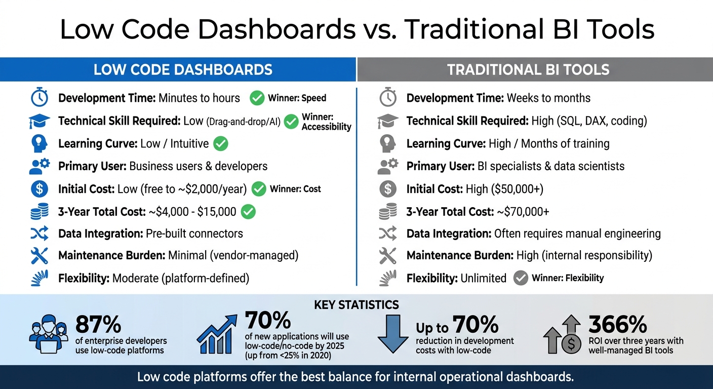
Low Code Dashboards vs Traditional BI Tools Comparison
When comparing low code dashboards to traditional BI tools, the differences are clear in terms of required skills, deployment speed, and overall cost.
Traditional BI tools demand expertise in areas like SQL or DAX, which often involves months of training. This reliance on specialized skills creates a bottleneck, as organizations depend heavily on IT professionals to develop and maintain dashboards. Low code platforms, on the other hand, simplify the process with drag-and-drop interfaces and pre-built components, enabling even non-technical users to design and update dashboards quickly.
"Data professionals still have their place in the organization, but they no longer need to be the bottleneck".
Speed is another key advantage of low code platforms. Dashboards can move from concept to production in just minutes or hours, while traditional BI projects often take weeks or even months. This ability to deploy quickly is especially important in today’s fast-paced business environment, where responding to market shifts or new data requirements is critical. Gartner projects that by 2025, 70% of new applications will use low-code or no-code technologies, a significant jump from less than 25% in 2020.
Cost considerations further highlight the appeal of low code solutions. Traditional BI tools often require costly specialists and consultants, along with ongoing maintenance expenses as APIs or data schemas evolve. Low code platforms automate much of this maintenance, potentially cutting development costs by as much as 70%. However, it’s worth noting that some low code platforms use usage-based pricing models, which could lead to higher costs as your organization scales.
The combination of faster deployment, reduced costs, and lower technical barriers explains why many businesses are shifting toward low code platforms for their dashboard needs. Below is a side-by-side comparison of the two approaches:
Comparison Table
| Feature | Low Code Dashboards | Traditional BI Tools |
|---|---|---|
| Development Time | Minutes to hours | Weeks to months |
| Technical Skill Required | Low (Drag-and-drop/AI) | High (SQL, DAX, coding) |
| Learning Curve | Low / Intuitive | High / Months of training |
| Primary User | Business users & developers | BI specialists & data scientists |
| Initial Cost | Low (free to ~$2,000/year) | High ($50,000+) |
| 3-Year Total Cost | ~$4,000 - $15,000 | ~$70,000+ |
| Data Integration | Pre-built connectors | Often requires manual engineering |
| Maintenance Burden | Minimal (vendor-managed) | High (internal responsibility) |
| Flexibility | Moderate (platform-defined) | Unlimited |
For teams managing internal dashboards that track operational metrics, low code platforms strike a great balance between speed, affordability, and ease of use.
Conclusion
Low-code dashboards are changing the way businesses interact with data, slashing setup times from weeks to just minutes. By combining natural language prompts with drag-and-drop tools, these platforms eliminate traditional roadblocks, like lengthy departmental handoffs, that used to slow down access to insights.
The numbers tell the story: 87% of enterprise developers now rely on low-code platforms for some of their analytics tasks, and 63% of companies cite improved efficiency as the top benefit of using data analytics. With the analytics market projected to hit nearly $97 billion by 2027, businesses that scale low-code projects to equip their teams with user-friendly, self-service tools are positioning themselves ahead of the competition. This highlights how critical it is to give every department smooth, direct access to analytics.
"The person who understands the business need is the same person who creates the dashboard. There is no translation layer between 'what I need' and 'what gets built.'" - Kissflow
The real game-changer here is democratizing data access. When decision-makers can directly tap into insights without relying on intermediaries, it reshapes the way organizations approach business intelligence.
For those ready to make the leap, the Low Code Platforms Directory is a great starting point. It offers tools to find platforms that fit your needs, whether you're focused on visualization, automation, or seamless integration with existing systems. This shift from IT-driven reporting to intuitive, self-service analytics marks a new era in business intelligence - one where every team member can act quickly and confidently using data.
FAQs
When should I use real-time vs. scheduled dashboard updates?
Real-time dashboards are ideal when you need instant access to live data. Whether you're monitoring daily operations, tracking key performance metrics, or making decisions that can't wait, these dashboards help you stay on top of fast-moving situations. They give stakeholders the tools to react quickly and effectively in dynamic environments.
On the other hand, scheduled updates work better for tasks like routine analysis, tracking long-term trends, or creating strategic reports. When a slight delay in data is acceptable, this approach simplifies system demands and cuts costs by avoiding the need for constant updates. It's a practical choice for scenarios where immediate data isn't a priority.
What security features should a low-code dashboard platform include?
A low-code dashboard platform must prioritize security with features like strong authentication, robust access controls, data encryption, and frequent updates. Beyond these essentials, continuous monitoring and maintaining detailed audit logs are crucial for ensuring compliance and protecting enterprise systems. These practices not only shield sensitive data but also uphold the integrity of the entire platform.
How do I combine data from multiple tools without breaking reports?
To bring data from multiple tools together without disrupting your reports, consider using low-code dashboard builders such as Power BI, Rows, ToolJet, or Retool. These platforms allow you to link different data sources, pull in live data to create unified dashboards, and automate the integration process. This approach keeps your reports consistent and current while making data visualization easier and minimizing errors.